I thought this would be a bad month. I was wrong.
Most of the income that didn't come from manufacturing is from exploration (and the a-type invuln hasn't even sold yet...), but otherwise I think I'm going to stop tracking off-sheet income and expenses. For one thing, it's boring; for another, it hasn't been adding up lately -- probably because of sales of the cap mods and fuel I stock my building system with. I don't track this, and don't really mean to make large profits on it, but it seems to be making at least a billion isk per month.
What? Yeah, a billion isk per month by accident, NBD~~~
Maybe I should think about stocking more systems. There's one in particular I know would be a good market....
Anyway. The new 'ships carried' category under month-over-month change is for ships which were sold but won't appear on the sheet until next month because it's easier that way.
A noteworthy event is that I have actual liquid isk for the first time since starting manufacturing. This will probably go toward replacement component blueprints soon (tm).
Tuesday, January 31, 2012
Sunday, January 29, 2012
Loot pr0n
Went out to null for some exploration (using the minimize trick to avoid crashes). First site of the day is a 6/10 and bam.
Drop is worth 3458m at the time of writing.
EDIT: Prices on the invulns are dropping quickly, but I managed to sell it for 2.46b.
Sunday, January 22, 2012
Incursion tears: Epic edition
So anyway. You've probably heard of the incursion interdiction, in which people are forming fleets to kill sansha motherships, forcing incursions to despawn instead of letting the incursion runners farm them for days. This - even before they started killing moms - has produced an endless ocean of tears on the forums, to rival even the ice interdiction. And these are the very best sort of tears, the ones produced by highsec 'elitists' with an entitlement complex. The sheer, sadistic joy of watching them curse the gods and shake their tiny fists in impotent rage is intoxicating.
On saturday the incursion griefers rolled out and shut down all the highsec incursions. Three more popped up overnight, and by euro prime the mom sites were available. The interdictors rolled out again, and this time I joined up in a shitfit tempest.
We formed at 2100, hit the first site, and BTL contested it and tried to suicide gank us with ECM and smartbombs. The fun was doubled!
We lost a guardian to the gank attempt, they lost their ships and somehow managed to pod their own fc. We finished the site, burned to the other two incursion sites and took them out too, cackling madly on comms all the while. It took 1 hour and 50 minutes to end all three of them, completely shutting down highsec incursion running.
Now, serious business. Incursions are good because they get people to people work together. The incursion interdiction is also good because it is emergent, player generated content where people work together, as well as the most fun I've had in eve in years.
If you'd like to join in, here's how you do it:
Join:
Channel: Grief the bears
Teamspeak 3: 178.32.239.141
Fleets seem to roll around 2000
If you just want to harvest tears, watch the 'btl pub' and 'the ditanian fleet' channels, and the forums.
On saturday the incursion griefers rolled out and shut down all the highsec incursions. Three more popped up overnight, and by euro prime the mom sites were available. The interdictors rolled out again, and this time I joined up in a shitfit tempest.
We formed at 2100, hit the first site, and BTL contested it and tried to suicide gank us with ECM and smartbombs. The fun was doubled!
We lost a guardian to the gank attempt, they lost their ships and somehow managed to pod their own fc. We finished the site, burned to the other two incursion sites and took them out too, cackling madly on comms all the while. It took 1 hour and 50 minutes to end all three of them, completely shutting down highsec incursion running.
May need to open in new tab |
Now, serious business. Incursions are good because they get people to people work together. The incursion interdiction is also good because it is emergent, player generated content where people work together, as well as the most fun I've had in eve in years.
If you'd like to join in, here's how you do it:
Join:
Channel: Grief the bears
Teamspeak 3: 178.32.239.141
Fleets seem to roll around 2000
If you just want to harvest tears, watch the 'btl pub' and 'the ditanian fleet' channels, and the forums.
Thursday, January 19, 2012
Wednesday, January 18, 2012
Sunday, January 15, 2012
Blog design: How to be slightly less terrible
Everything in this post is probably covered in even the most basic 'how to blog' guide, but most eve bloggers aren't especially ~professional~. Hopefully someone will find this useful.
In this post I will be linking examples of what I'm talking about. This is done to provide illustration, not as a callout, so don't get butthurt.
Ads:
Nobody likes ads. If you aren't making actual money, get rid of them.
Text color:
Most of your readers will be subscribed using a newsreader. When the newsreader imports your posts, it will usually change the default text color to black and display the text on a white background. However, if you manually change the text color, the newsreader will use the manual color.
This means that if you change text in a post to a color which is hard to read against a white background, your readers will have a hard time reading it.
Put another way: Never, ever, ever use yellow text. More generally, any color which isn't easily visible against both light and dark backgrounds should be avoided. If you must change text color, mid-range blues and greens are usually okay.
Gadget creep:
You can have your blog display popular posts and blog stats and pages and followers and a search box and links to every eve blog in existence and every eve site in existence and labels and a profile and the tweet fleet stream and seven different ways to subscribe, but that doesn't mean you should. What you're actually doing is drowning your content under a river of crap.
If you don't personally use a gadget, get rid of it.
Labels:
Labels should be useful tools for your readers to find different types of posts. This means:
Labels should be meaningful, not something you make up on the spot. Define them for yourself in advance.
Labels should be applied consistently. Clicking on a label should display every post relevant to that label.
Labels should be widely applicable. If you have 100 labels and 90 of them are only used for one or two posts, you're doing it wrong.
Banners:
If you have a huge banner causing your content to start halfway down the screen, you're doing it wrong.
If you have multiple banners, you're doing it wrong.
If you have a text title, then a banner above or below the title, you're doing it wrong. They should be co-located.
Backgrounds:
Backgrounds should not be brighter than the content of the blog. It's visually distracting.
Unless you really know what you're doing, don't try to use a static background image. If you think you know what you're doing, test it on multiple monitor sizes anyway, and even then make sure the image fades to the page background color.
If you have a background image or colored background, be extremely careful using transparent backgrounds for your posts. If you must do this, the transparency should be very slight (e.g. 5-10%) and you should be very careful that it does not interfere with reading.
Saturday, January 14, 2012
Blag update, part 2: Theme warrior, labels, guides
Wasn't actually planning to keep going, but it seemed like the right thing to do.
- All unecessary objects have been removed from the template.
- Blog list has been trimmed aggressively.
- Labels for all posts are now correct and consistent. All useless labels have been removed. Some of the remaining labels are specific to files which are currently unavailable, however.
- All labels, with descriptions, have been added to the 'Label index' page.
- All still-useful guides have been added to the 'Guide index' page.
- Added favicon. Didn't turn out like I'd hoped, and I am undecided as to whether I should use the default blogger icon. This will probably be revised repeatedly.
Wednesday, January 11, 2012
One hundred
"One hundred what?" you ask. One hundred posts? One hundred million skill points? One hundred million page views on Equestria Daily?
No, no, and... yes, actually, and at almost exactly the same time, but that's not what I'm talking about.
I just delivered the 100th capital ship from my manufacturing project. To my deep and abiding shame it was a phoenix, but at least margins on them are unexpectedly decent right now.
The first ship was a chimera, delivered on July 15 . That was about 5 months ago, which gives us an average of 20 ships per month.
I'm okay with that.
Generic new layout post
Got tired of black on white and changed to white on black. It just looks better.
Plus, screenshots stand out more. Though screenshots with a lot of whitespace (like spreadsheets and EFT) stand out more in a bad way.
Whatever. I expect I'll end up reverting it after not too long.
Plus, screenshots stand out more. Though screenshots with a lot of whitespace (like spreadsheets and EFT) stand out more in a bad way.
Whatever. I expect I'll end up reverting it after not too long.
Saturday, January 7, 2012
Capital manufacturing update: Full stop
The effect of this notion? I very much fear, 'twill make doubtful all things which were formerly clear
-Schrodinger's Cat, by Cecil Adams
In my december monthly financial report I mentioned that something had gone horribly wrong with my spreadsheet. Today, we discuss what.
Basically, component quantities.
When crucible hit, drone bays were removed from dreadnaughts. Then, for each 5 drone bays which were removed from a dread, 1 was added to the carrier of the same race. What I didn't notice was that the changes didn't stop there. Possibly I should read the patch notes more closely next time.
Since I build components for runs well ahead of where my blueprints are, it took a while for the effects to be seen. In Mid-late december I found myself running short of components when I shouldn't be running short of components. This prompted me to check my blueprints against my spreadsheet, and what I found was that different components had been added to dreads, in numbers which I suspect are equal to the number of drone bays removed. This is what was causing me to run short.
This prompted a full check of all my other blueprints, and I discovered that carrier components had also changed, but only a little -- they had two or three components removed total, of similar types to those added to dreads. I suspect that the number of components removed from carriers was equal to the number of drone bays added, though I can't prove it.
So I had to:
-Change the base component quantities for each carrier and dread on my spreadsheet, and make sure they gave the correct answer for the materiel level of my blueprints.
-At this point my spreadsheet was chill, so I just had to update ship prices and margins on the little thingy what tells me which ships are better but doesn't really affect what I build.
-With that done, I still had little idea how many components of each type I had too many or too few of, so I put a hold on new runs and and waited for ship builds to catch up so I could see where I stood in terms of components.
-I was short of some components, so I had to build the ones I was missing. Minerals for this ran around 520 million, which I've subtracted from my monthly profit spreadsheet as a correction. I also ended up with 5 extra components of different types.
By the way, if you think capitals are really expensive right now? They aren't. Other than chimera, archon, and revelation, margins are looking frankly depressing.
Tuesday, January 3, 2012
Depressing blog meme: Days logged in
The eve server keeps track of how long you've played on each account. It can be retrieved thusly:
EDIT: There is an easier way:
https://api.eveonline.com/account/AccountStatus.xml.aspx?keyid=_____&vcode=_____
Where underscores are replaced by your API key ID and code respectively. 'logonMinutes' is the relevant data field.
My highest active account has 243 days since 10/2008. My first account (currently lapsed) started 10/2007, but I have reason to believe this one has more time on it.
Alternate method below
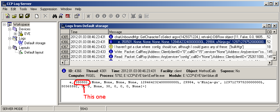
EDIT: With some people trying this it looks like we're getting variable results. Keep in mind that the 'charunboundmgr' message is split across two lines in the log server. If you can't find the four nones, the message also contains two fields which are either 'true' or 'false', and the number is immediately after the second one. In the screenshot, the message split before the 'e' of the second one.
EDIT: There is an easier way:
https://api.eveonline.com/account/AccountStatus.xml.aspx?keyid=_____&vcode=_____
Where underscores are replaced by your API key ID and code respectively. 'logonMinutes' is the relevant data field.
My highest active account has 243 days since 10/2008. My first account (currently lapsed) started 10/2007, but I have reason to believe this one has more time on it.
Alternate method below
- Quit eve
- Go to the eve directory
- Start logserver.exe
- Go to file->new workspace
- Start eve and log in to the account you want to check.
- In the log server, go to edit->find, toggle the 'search up' radio button and search for the term 'charUnboundMgr'
- This message will probably be split across two log entries, and be above a message starting with a yellow circle with an exclamation point in it.
- Read along the entry until you see 'None, None, None, None'. The number just previous to that is the number of minutes you have logged in on that account. Take that number, divide it by 60, and divide that by 24 to find days played.
- Note: Exiting the log server before the client will cause the client to crash.
EDIT: With some people trying this it looks like we're getting variable results. Keep in mind that the 'charunboundmgr' message is split across two lines in the log server. If you can't find the four nones, the message also contains two fields which are either 'true' or 'false', and the number is immediately after the second one. In the screenshot, the message split before the 'e' of the second one.
Subscribe to:
Posts (Atom)